

The best ampersands for graphics.
 When you’re working with text, especially for decorative graphics, the chances are that you have some beautiful ampersands installed on your computer. Don’t simply use the ampersand that comes with the font you are using – experiment.
Below you’ll see some examples and these will give you some idea of how a couple of words in a basic sans serif font can bring the ordinary to life.
See a few favourites below – in alphabetical order.
Caslon Bold
The ampersand developed from the letters ‘e’ and ‘t’. (‘Et’ means ‘and’ in Latin). You can see this in the Caslon ampersand below. It flows beautifully.
Courier New
This is very unlike the previous example. This is a very light ampersand with a certain delicacy. It hovers between having an old-style typewriter feel and a modern, crisp look.

Garamond Italic
To me, this is the best of all ampersands. Note that this is the italic version. The regular one is also well-crafted but the italic is perfect for adding flair and movement.

Impact
Impact, seen below, is a very no-nonsense ampersand. It’s functional and dominant but also very stable and bold. It has a look that is reminiscent of the nineteen sixties so ideal for nostalgic work.
Lithos
See Lithos below. It’s light and airy. The two arcs that make up this ampersand intersect wonderfully. It has a modern look with a strong touch of elegance.
Trajan
At first glance, this is rather like the previous example in shape. But you can see that it differs quite a lot – it has much more elegance. If you think that it looks rather as though it should be carved on stone, you’re right.This font was based on Roman carving.

Trebuchet
You can see the origins of the ampersand in this example from Trebuchet. This is a classical look but also has a hint of fun.

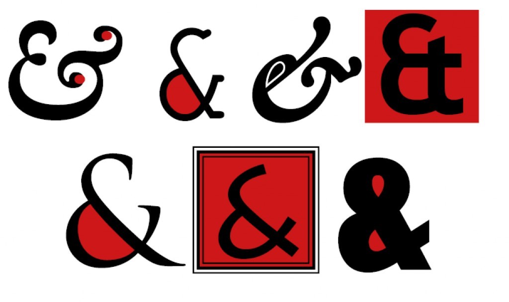
Enjoy ampersands
Make the most of these beautiful symbols when you are creating graphical text. See some of the fun you can have with them below.
ABOUT THE AUTHOR

November 24, 2015
I love ampersands. Weird, I know, but I admire their history, elegance and brevity. My favourite from above is Trajan. It reminds me of someone stretching out in a comfortable chair. Garamond Italic reminds me of a lizard’s head leisurely grabbing an insect and swallowing it down. Thanks for the article; very interesting – and a visual treat.
November 24, 2015
Thank you Colin, it’s good to know that I’m not alone in my love of ampersands! I love your interpretations of what they look like. Don’t you think that the Courier New ampersand looks like a dog begging for a treat?