

Graphic author resource boxes: Why and how.
 Why should you have a graphic author resource box?
If you’re an online writer, you know how important it is to have a ‘signature’ for your articles. In addition to other considerations, it’s a valuable aspect of the brand you are creating.
Mostly, this will be a text resource box (see the bottom of this page) but there are several good reasons for having a graphic version too for additional exposure.
You probably have articles on several different sites including your own. But whatever site is showcasing your work, you have a goal in mind – a call to action is required.T
This may be,or include:
- You want to encourage readers to visit your own site
- Visitors can be directed to a specific landing page where you’re selling a product relevant to your article
- You may want readers to get in touch with you for further information
- It may be that you want them to follow you on one of the various social media
- You might want readers to discover more about you and your authority on the subject
So why use a graphic?
Some sites, including this one, permit a small photograph and a specified number of words in the text. So why use a graphic?
- Author boxes are usually generic – deliberately. The site management will want to have a unified look. People can ignore them because they are so used to seeing them
- Because they are generic, they do not reflect your brand – a graphic does
- Text can be bothersome for the site management when it comes to the keyword density of the page – a graphic avoids this
- If you have unoriginal content on you article, lyrics or quotes for example, plus a generic text box, you are adding to the possibility that search engines see a percentage of duplicate content on your article
- A graphic box is much easier to add to a page. If you write guest posts for other sites, this is considerate towards the site management
- You are in control of what information you give to your readers
- Your graphic becomes a valuable part of your brand – readers see it was a recognisable logo
- It’s easy to email to other sites
- You might have your work on different sites with different colours and layout. Your graphic resource box gives consistency for your readers, whatever platform you use
- You can easily use your graphic for offline purposes also
Examples
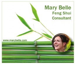 In the example on the right, Mary wants to show the services she offers. As you see, she is a Feng Shui consultant.
Because this is a way to simplify your life and create a feeling of harmony and lack of clutter in the home, the graphic reflects this by its minimal design.
Because this discipline has its origins in Asia, the bamboo motif is added to reflect this. It shows a simple way of life, with natural, calm elements.
Mary links this graphic to her website – her goal in writing on other sites is to encourage readers to visit her own internet ‘home’ to find out more.
 How much information do you want your readers to have? Remember, with a graphic, it’s entirely up to you.
Janet, for example, see on the right, is a travel writer. The important thing that she wants her readers to know about her is that she is an expert on tourism and travel in New Zealand. You can see how this would work well for a real estate agent or other businesses that are location based.
She is enhancing her expertise and authority. The image can link to her own site, her Facebook page or wherever she chooses.
 This resource box belongs to a photographer. He has chosen one of his own photographs to demonstrate to his readers the type of work he creates. You can tell immediately that he is classed as an ‘art photographer’ and not the sort of chap you’d use to shoot your wedding snaps.
In a slightly whimsical touch, his face has been added to the open door. It suggests that this is a ‘doorway’ to further information. It links to his website and because his name is in the URl,that and the image of his face, helps the reader to ‘get to know him’.
……………………………………………
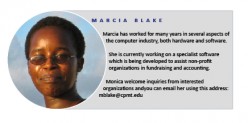
Marcia’s example resembles the more traditional resource box as she wants to give the reader fuller information about herself. The image would be located at the bottom of her articles, running the width of the page.
For this type of resource box, it’s necessary to use a plan, unfussy font. This ensures that the text is readable when the box is viewed on cellphone or other device with a small screen.
Depending on the site on which its used, she decides where the box should link to on an individual basis.
 It’s always a good idea to have a photograph of yourself in your resource box. People who are reading on the internet like to know who it is they are interacting with.
But if you don’t want this then Keira’s example shows an alternative. It still shows a ‘human face’ without revealing her exact identity. She has chosen too to use her first name only.
The simple tagline at the bottom of the box shows exactly what readers can expect when they click through to her website.
 Sam doesn’t want to be immediately recognised so uses a slightly quirky image – which suits his style of writing- where his hand covers half his face.
Note that the colour used for the background of the image is taken from the colour of his shirt to ensure consistency and visual appeal.
It’s a memorable image that you’d recognise if you saw his work elsewhere.
 This is another resource box that give the reader plenty of information about the writer. Note that the photograph has been flipped. In the original, Marie was looking to the left but now she seems to be reading her own information- and subtly encouraging the reader to do the same.
In the copy, it asks readers to click the image to sign up for her weekly newsletter.
 This example uses a photograph that visually explains what the writer’s business is all about.
The URL underneath the image reinforces this and encourages the viewer to click through to visit the website.
Note that the photograph has been manipulated so that her garment and the background are the same as the flowers at the bottom right of the image, creating a consistent look.
It is visually strong and memorable and enhances the attractive aspect of her work.

Suzanne has a website that explains how to live simply and effectively using natural products.
The simple graphic reflects her way of life and the philosophies that her site explains in greater detail, showing a variety of helpful articles.
To create a softer, simpler look, the colour for the text has been taken from the photograph. The text at the bottom explains exactly what Suzanne would like her readers to do.
 The examples we have seen above have been horizontal in their aspect. The horizontal versions can easily be used for printwork too – such as business cards, ads in magazines or as promotional postcards.
But that doesn’t mean that they necessarily need to be as you can see on the right.
Joe, whose first example you see at the top of he page, also has a skyscraper resource box. This way he can select which to use for different sites.
The skyscraper is ideal for using in sidebars. It also looks very striking when shown on the righthand side of the body of an article.
The use of black and white is a great choice too – especially if you write for several different sites. They will all have their own colour schemes and you can guarantee that a monochrome image will look good regardless of the colours used on any other website,
Joe is encouraging readers to perform two actions here. The first is to visit his website. The second is to follow his huge Twitter account where he extensively promotes his work and features special offers.
The minimalist look makes this very striking but there is plenty of space available, should Joe want to add additional information.
It makes an effective ad in print magazines, newspapers and journals and because Joe is a published writer, he also uses this image in print. He has it printed as bookmarks to give away when he is at book signings or other promotional events.
ABOUT THE AUTHOR
