

How to create quick business cards.
 Even today, business cards are still in use. The problem is though that we don’t need to order hundreds as we used to in the past. But how can this be done economically?
In the days when we lived offline things were different, but today few of us need hundreds of business cards but we don’t want to a) employ an expensive designer and b) buy in bulk. There is an answer.
You don’t have to be a designer to create effective and attractive cards and today, using an online service, you can upload your design and order as few as fifty cards.
Photographic business cards attract they eye and will impress your potential clients. They are also perfect to showcase your work. Today, we are much more visual than ever before, hence the success of sites such as Pinterest, Fooderfic and Yummly.
What’s more, by using a great photograph they are easy to design yourself using the simple steps below.
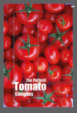
Select your photographs
 Choose photographs that are great quality and show well what your company or home business does.
Ideally, these should be photographs you take yourself and there’s no need to employ a professional photographer. Today photographs taken with your cellphone are high enough quality for business cards. Choose close ups if you can- you don’t have a lot of space. If you can’t create your own, locate stockp hotographs – you can often find them free online.
Business card sizes
In the USA and Canada business cards are 3 inches by 2½”. This means that your artwork should be slightly larger (3.33″ x 2.61″).
The online company I recommend also create cards which are 2.56″ square (artwork size 2.71″ square).
Select your font
 Choose your font with care. A common amateur mistake is to choose a font you personally like, rather than one that reflects your business.
Type your company name into a Word document or similar in a selection of fonts , print it and study it closely. Which of these fonts suits your business? Seeing them on paper – as they will appear on your business card – helps you to evaluate them. See examples on the right.
Looking at the examples I have chosen, by personal favourite font is the second on the list – I like them all – but that doesn’t mean it’s right for the job. Studying them,I decided that the one at the bottom is the right one for this particular business.
It is solid, bold and has a pleasant roundness that makes it ideal for a company that sells tomatoes. It’s clear, readable and effective.
Be sure to choose a font that is simple – a professional business card is no place for fancy display fonts. Handwriting and ‘cute’ fonts also are unlikely to give the right impression unless they are extremely well created examples.
Set up your file
 Open a new file in your drawing program. If you don’t have Photoshop,you’ll find that there are several excellent programs online that are absolutely free.
Remember that your file size must be larger than the finished card (refer to the figures above). Set up guides – those faint lines you can see in the image on the right – to help you line up the text correctly.
Because the message we are getting across with this card is ‘TOMATO’ you’ll notice that I have made that word larger than the others. ‘The Perfect’ ‘Tomato’and ‘Company’ are all in separate text boxes so that they can be resized individually.
This means that you can also easily colour them individually. See the example at the top of the page.
In the image below, you can see how the card looks without its guides. This is what your final business card will look like.
Adjust the sizing
 In your drawing program, you can easily move the text to be sure that it looks exactly how you want it to be.
Try moving the text to various location within the file. Does it look better at the top? At the bottom? Left aligned? By all means spend ten minutes experimenting until you have the text located where it will look the best.
By using the ‘free transform’ tool, you’ll be able to quickly resize the text boxes – just be sure to hold down the ‘shift’ key so that proportions are maintained.
You’ll see that in this example,I decided that the text looks better at the bottom of the card where it doesn’t interfere with the great image.
By experimenting with moving the three text boxes, I settled on an asymmetric look with ‘Tomato’ and ‘Company’ being left aligned and ‘The Perfect’ moved over to the right.
This adds interest without being obtrusive or detracting from the message. These cards a two-sided so it’s a good idea to keep the text to a minimum.
Check the alignment
 You can see here that the three text boxes have been carefully aligned. Look at the pale grey guide line on the left. You’ll see that the ‘C’ is situated exactly below the large ‘T’.
On the right, see that there is a guide line that runs down the centre of the ‘f’ and the ‘t’. Zoom right in and use the arrow keys on your keyboard to move the text boxes in tiny increments.
Use the eyedropper tool
 If you re using different colours for your text, then pick those colours from your photograph. This ensures a fully coordinated look.
The image on the right shows the card that’s at the top of the page – here seen in design view.
The four small squares are just a simple design device that just adds a little extra to your card, adding visual interest and drawing the eye to the text.
Again, the colours are taken from the photograph using the eyedropper tool. Small circles of colour would work equally well and are quick and easy to add.
Use white space
 I’ve found that often trainee designers are rather frightened by white space. They feel that space is there to be filled.
But the white space creates shapes and adds visual interest to your card. It helps your product – in this case a humble tomato – to stand out and leaves the recipient in no doubt exactly what it is you are selling.
In this example, the business’ web address has been added at the bottom. This is in a green colour picked out from the tomato’s stalk using the ever-useful eyedropper tool.
Now, we have created three very simple, very easy and quick examples of attention-grabbing business cards. Of course, there is still the function of the card to deal with. When you give your card to a potential client,you want them to have your contact information.
This will go onto the reverse and it’s worth taking a moment to decide just how much information you’d like to add. Again, it’s a good idea to keep things simple. Don’t overload your card with too much overwhelming text.
Setting up the back of your card
 Create another file in your drawing program. To achieve consistency, copy and paste the text from the front of your card.You can then adjust the size and the colour and add more details.
In most cases, the first thing you’ll want to add is your name. Decide too how you want people to contact you and add that information too.An email address and phone number will be enough – the recipient doesn’t need to know your Skype or LinkedIn at this stage.
Your website address is essential.
Some people prefer email contact to be via the form on their website as these are recorded and can be analysed so there’s no need to add your email address unless you check it very regularly.
If you encourage visitors to your physical location – and not all businesses do – then add that too but don’t overload the space with too much; stick to the basics.
It’s a good idea to leave plenty of white space in case the recipient wants to jot down notes.
Once your files are ready, all you have to do is visit this site to order your cards.
ABOUT THE AUTHOR
