

Formatting print pages: Quick and easy
Transform boring print – fast
If you’re a designer, you’ll be familiar with the client who sends you a Word document and a photograph and expects you to transform it – in no time.
Can you please make this look better? No colour please, we can’t afford colour printing. Speaking of which, the printer has a huge workload – can it be ready within half an hour please?
You might find yourself having to do this
You might find that you need to do this yourself. You can easily transform a page of copy and a photograph into something more attractive and readable. It may be that:
- You want to inform your clients about a new product or service you offer
- Maybe you need to create awareness for a charity
- You might want to create a PDF download for your site or blog
- Your company or organisation needs a newsletter
- You’re attending a craft fair or trade show and need a handout sheet
- You’re a teacher creating print materials for students.
It’s easy to do in just a few simple steps:
 The original document
This is the sort of thing you might start with. You’ve created the document or someone in your organisation or business has passed it to you. There’s lots of text and the writer had added the photograph quote randomly.
You’ll see that the document is made up of five major elements.
1. The body text
2. The small photograph
3. The two line headline
4. The caption for the image
5. The byline for the author
It’s boring, hard to read and it needs help!
________________________________
First things first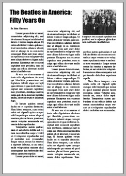
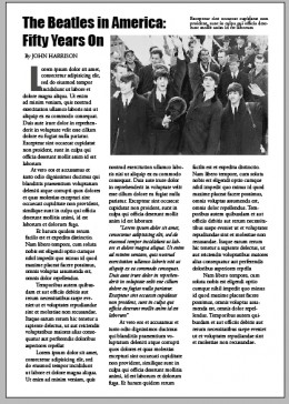
If you look at the image on the right you can see that three of these elements have changed.
Firstly, the body text has been transformed so that it spans three columns.
This is far more readable. In newspapers and magazines, people are used to reading columns rather than a text that flows the full width of the page.
I’ve also changed the font to a more readable on – this is Garamond. The copy arrived in Times New Roman, which is a fine but basic font. Using something a little more elegant uplifts the piece and gives it greater weight due to the traditional, classic typeface.
Whilst working on the text, I’ve indented the first sentence of every paragraph. This gives them definition and is easier on the reader’s eye.
Although a mix of too many fonts is to be avoided, using a headline font is acceptable. Here, I’ve used Impact and made it larger so that the reader knows exactly what the article is about. Note that the line break is now after the colon – much tidier and easier on the eye.
In the original document, the photograph’s caption was the same size as the body text, so I’ve made it smaller to differentiate it.
_________________
 Working with the photograph
Visuals are terrifically important. They attract the eye and engage the reader. Websites such as Pinterest show us how important images are to today’s readers.
The photograph therefore has been made a little larger. Note that it now lines up exactly with the second and third columns. These tiny spacing details are the difference between amateur and professional work.
Those tiny details make all the difference and they are quick and easy to do.
You’ll notice too that I have moved the photograph’s caption. The left hand side of the cation lines up with the space between the second and third columns and the right side lines up with the right hand side of the photograph.
The caption text has also been changed to italic Garamond to further differentiate it from the rest of the text.
The obvious problem now is that the larger photograph has not left enough space on the page for the copy.
There are several ways in which this can be fixed.
___________________________________
 Making the copy fit the page – easily
We can start by slightly extending the width of the three columns which ads valuable space without crowding the text.
Another way to reduce the size of the copy is to do away with the justification. By making the text left-aligned instead of justified, we have more room. This is because justification adds unnatural spaces between the characters.
Looking carefully at the copy, I noticed that paragraph in the central column is a quote. This is a great opportunity to create even more space.
By formatting the quote in italics, more space is created.
For added visual interest, and to make the page look more professional, I made the very first letter of the article into a drop capital. In doing I used Impact, the headline font, add visual – but coordinating – interest. I made this grey so that it didn’t look to be too bold and overpowering.
The three columns are aligning reasonably well at the bottom of the page but now we have created more space, we have additional room at the end of the article.
This is easy to fix.
_________________________
 Disguising excess white space
It’s easy enough to adjust the font size or the line spacing in order to fill the columns correctly but it’s less time consuming to add decorative touches that can be adjusted in size.
There are two ways I like to do this and both are quick and easy to do. In both examples,I have added an object that can be adjusted in size so that they take the place of some of the copy, thus filling the columns neatly.
THe first of these can be seen in the image on the right. It is the quickest way too. At the end of the article I have added a text box and placed a decorative flourish inside it. By adjusting the size of this box, the excess space is used effectively.
It also helps to give the article a definite end. You can think of it as a visual full-stop.
There’s another small decorative touch that has been added too. Where the author’s byline appears at the beginning of the article, two thin lines – above and beneath the name – have been added.
The author’s name has been changed too so that it is now in all-capitals. This is decorative but it also adds to the authority of the author.
______________________________
 Making all three columns align at the bottom of the page
It looks neater, although it takes slightly longer, if all three columns are lined up at the bottom of the page.
To do this, create a text box and type in a few words.
You could take a short quote from the article for your text box. Alternatively write a short (about half a dozen words) that summarise one aspect of the article. You can see an example on the right – ‘The Beatles Taking America by Storm’.
Move this to the middle of the second and third columns as you see here. Add text wrap so that the body text will flow around the box.
With the free transform tool, you can now adjust the size of the text box until it is just the right size and the bottom of the columns align.
For variation and added visual interest, the headline font has been used. (This proves that designers don’t need hundreds of typefaces to create professional work. Most pros tend to use the same ten or so fonts for eighty percent of the time. The classics work best.)
Finally, I gave the call-out text a little transparency so that it doesn’t’ shout’ at the reader.
Before and after
Before:

Fifteen minutes later:
ABOUT THE AUTHOR
