

Use Google Chrome to see your site on multiple devices
Now that Google is so concerned about how websites look and behave on mobile devices, it’s handy that Chrome also gives us a useful way to find out how our sites appear and function without having to own every type of phone or tablet.
We’re a reasonably online household so we can physically check sites on various generations of iPhones, an iPad, Kindle and of course, our laptops but what about all the various versions? And what about those Galaxies and Samsungs and Motorolas and so on? What about all those tablets I’ve never even heard of?
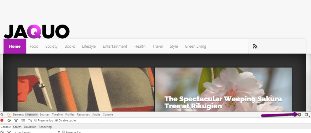
 With Chrome,it’s easy with the ‘developers tools’ section of the browser. Depending on your version of Chrome navigate to the developers tools using ‘file’ or, if you’re like me, the ‘hamburger navigation on the top right of the browser. (See image on the right).
You’ll now navigate to the following:
- More tools
- Developer tools
You’ll now see something like this:
Note the bars below the site
 You’ll see that there are bars below the site that can be enlarged by dragging them but in the meantime, you need to go to the cog icon shown by the arrow in the image above. (And on the right).
This allows you to disable cache. See below – just check the box.
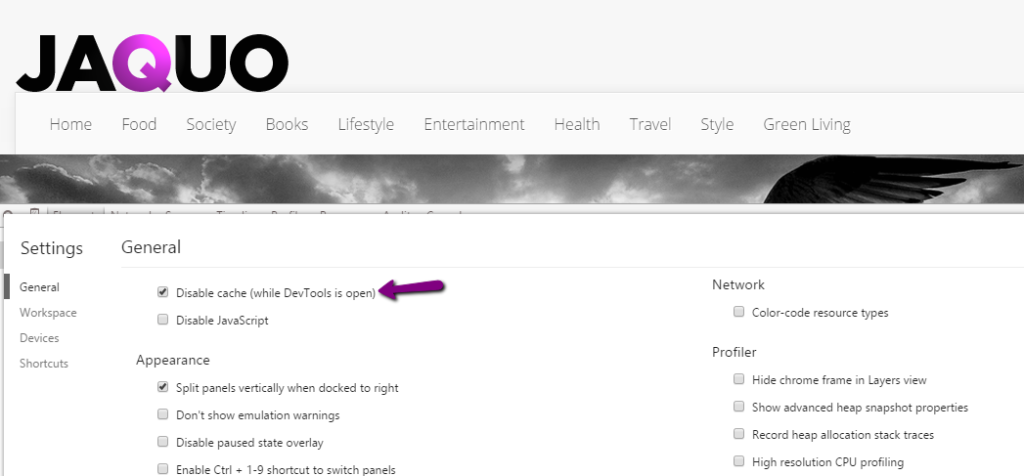
Check the box
Close the box,there’s an ‘x’ on the right to do so, and you’ll notice that there’s a cellphone icon on the left. Click that – see the image below.
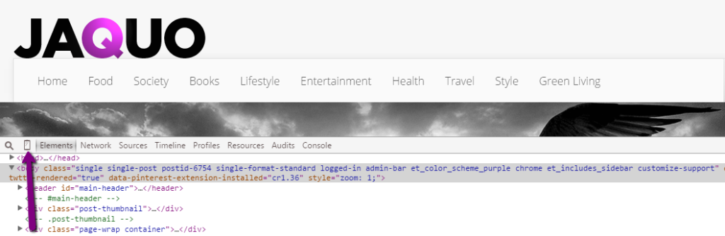
Click the cellphone icon.
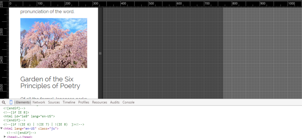
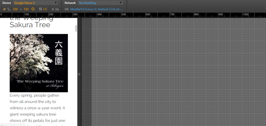
Now you will see how your site looks on a phone.
A JAQUO article visualised on a cellphone
But what about all those different phones and tablets? At the top,there’s a drop down with a variety of different devices. Simply choose the ones you want to emulate. You can see the drop down below.

The chances are that if one article looks fine then all will but to be sure, check a few samples. You cansee below that I’m checking this one out as it appears on a Google Nexus.
Check articles
Icon
As an example, here’s a site that doesn’t work well on a phone (A Samsung this time). Note that the tool helpfully tells you underneath what the problems are. If you don’t see them, click ‘open drawer’ -it’s the blue icon next to the cog.
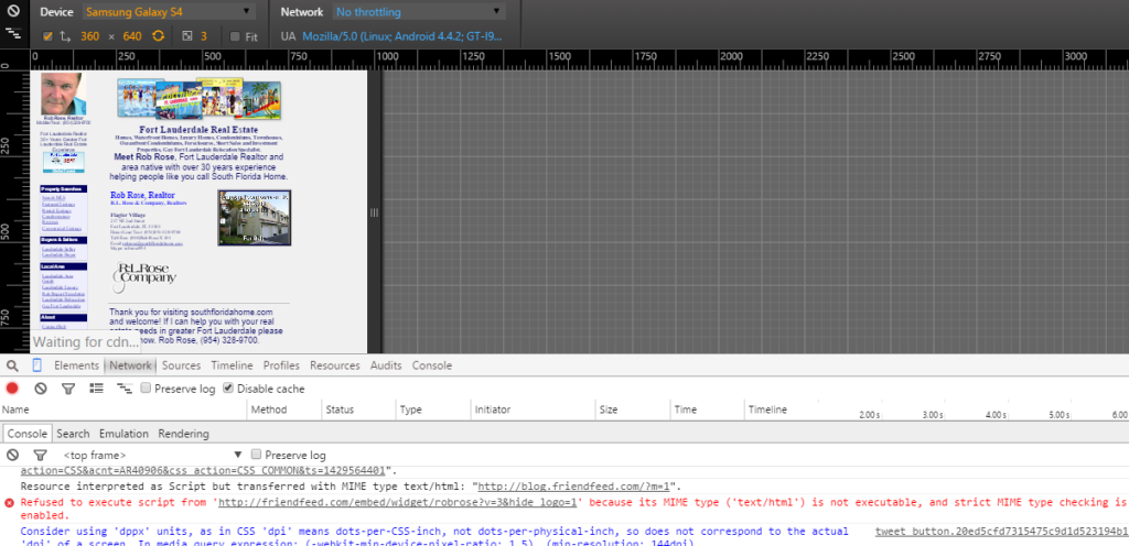
A site that is not cellphone-friendly
As you can see, Google doesn’t like the site you see above because the navigation on the left is too small, as is most of the text. You can check for technical problems as they are shown in red below. Sometimes these will be coding problems that you can’t fix. Others you can – this site, for example, showed a problem with the configuration of the Facebook ‘like’ button. For errors like these, just update the plugin if there’s an update available or find a newer, better version.
How does your site check out?
