

Working with text: Tables
Format a menu using tables
I have several clients who are restaurateurs and they know the importance of well-presented menus.
Therefore, I often find myself working on them. When working with almost all text jobs, creating tables and cells is an important way of layout out the information.
They keep the text in a regular, tidy form with nothing to distract the eater from the menu offerings. Oh, and I always like to add a couple of design touches too to give them a little extra sparkle. The menus in this example are for a hotel and they are placed into the guestrooms to encourage guests to order breakfast from room service.
Sometimes, I have photographs of menu items to work with but for the purpose of this exercise, I’m assuming that they haven’t been provided.
Instructions:
1. Usually, the text arrives to me and had been typed by the chef, the restaurant manager or one of the clerical staff.
See the image below to see what I mean
You can already see that it needs immediate help. It’s very basic. Having the items’ descriptions divided by slashes (/) doesn’t make it easy to read. Neither do the dashes alongside the prices. There are some capitalization and spacing errors too.
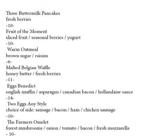
Original document
2. So let’s tidy up the copy first.
We’ll remove the punctuation marks (/ and -) so that the text flows and can be read more easily by the diner.
I’ll change the font weights too so that the menu items stand out from the descriptions.
You’ll see in the image below that words such as ‘Canadian’ have now been capitalized and the descriptions are easier to read. I’ve also centralized the text and it already looks so much better.
But we still have a a couple of problems.
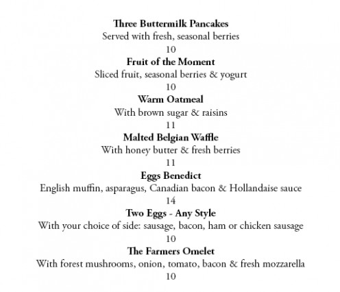
Tidy the text
3. The first problem is that, well, it’s boring.
The menus will be going into letter-sized menu holders so we can’t make the paper smaller or the text bigger. We need more interest.
The second problem is that it just doesn’t sell.
It gives information but it doesn’t encourage ordering. So first, we’ll insert some tables in order to keep the text in place and perfectly spaced.See the image below.
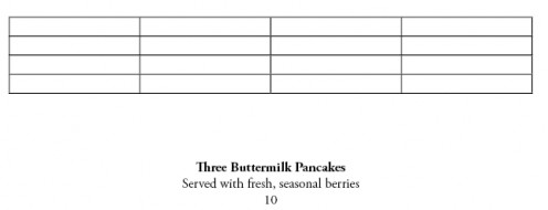
Table
4. I like the idea of having the menu descriptions inset slightly from the left of the page.
This way, the eye travels down the page seeing the menu items first and then, if the potential diners sees something that interests them, they can read further details.
The reader gets a quick overview first of all the goodies on offer. By merging and splitting the cells we can arrange them so that we have the inset, plus know that the prices on the right will be lined up perfectly.
You can see this in the screenshot below.
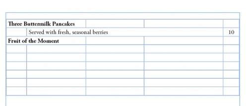
Text in table
5. By cutting and pasting the copy into the cells, we have the menu that looks lined up and organized. See the image below. Then, let’s see how it looks when we preview it and see it as it will look when it’s finally printed.
Text in table
6. Below you’ll see how our text is looking.
This looks pleasantly organized and easy to read. It’s changed a lot since we received it from the restaurant but it’s still pretty boring and really, it’s not encouraging anyone to order breakfast. In fact, it would probably go unnoticed in the hotel room.
So now it’s time to have fun with images.

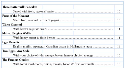
7. Because this is a good hotel, I think that adding a touch of elegance is in order.
I’ve added a heading in French, a language that always gives the subliminal impression of great food, and a copyright-free botanical drawing that I found on Wikimedia Commons. (I use stock images for clients).
Why this drawing? Not only is it stylish, it also shows an orange. Again, this is subliminal (but not so subtle) message that the best way to start the day is with a great breakfast and freshly-squeezed orange juice.
_
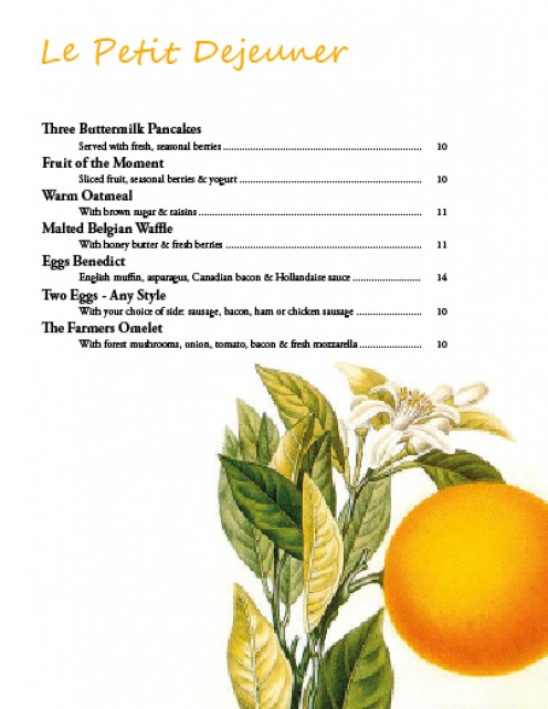
8. More fun. As you’ve seen from the menu, the chef at this hotel uses seasonal berries. A little quick internet research shows that the most popular of these are strawberries.
So when strawberries are on the menu, let’s have a version that says so – visually and with impact. Even people who will order a less-than-healthy breakfast will be attracted by these fruit.
The color of the header and the separator bar is taken from the image, using the eyedropper tool.
_
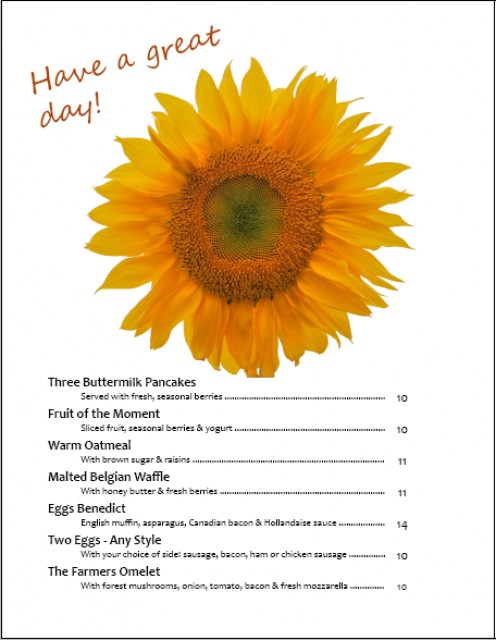
9. Breakfast is the most casual meal of the day, especially when it’s served by room service.
So the third design has a more casual feel.
The font in the copy has been changed and I’ve used a happy sunflower symbolizing freshness and sunshine. Instead of the rather boring ‘breakfast menu’ heading I’ve added ‘have a great day’ in a handwriting font. Because this has been rotated on an angle, it gives the impression of being jotted on there by a friendly member of staff.
Once again, the color is selected from the photograph to achieve instant coordination.
_
ABOUT THE AUTHOR
