Microsoft has made a great browser — at last.
I’m not joking. For over twenty years – almost my entire internet life – I have genuinely hated Microsoft’s Internet Explorer. I mean, hated. So when I started using Windows 10, I fully expected to delete the supplied browser from my system in order to free up space.
I’m so glad I didn’t. Believe it or not, it’s a splendid browser. Aesthetically, it’s perfect; minimal and spare. And if I like this browser, then those people who liked IE (or at least, tolerated it) are bound to enjoy using Microsoft Edge. Here’s a screenshot.

Note that you can have the option of the dark browser (as seen above) or the light. That’s all that’s needed, I think we all got over fancy skins a long time ago. As a web designer, I love the way that there are no bells and whistles to distract the viewer from my carefully designed content.
But what about functionality?
That’s what most users are concerned about. Well, Edge is fast and zippy plus it has several features you’ll enjoy.

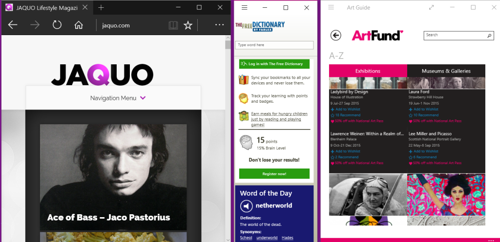
Even when you have minimised your browser (this screenshot shows it at just over 400 pixels wide) responsive sites look fantastic and work well. This means that even if you have a small screen, as I do on my laptop, there is still room for other apps to be displayed alongside. See below.

A feature that will be loved by viewers, but hated by those sites that are chock-a-bloc with ads, is the reading view. This strips away ads and extraneous content and simply lets you concentrate on reading the article.

As you can see in the screenshot above, there are no annoying ads or flashing annoyances. This might be bad news for marketers but for content writers it’s wonderful to think that people have an option to actually read what you’ve written without being distracted. The read view doesn’t show videos which is something Microsoft may wish to reconsider in future but images remain as you can see in the screenshot below.

This means that if your articles feature maps or infographics your viewers will still see them.
Sharing
The read view also does not show share buttons but this isn’t a problem because Microsoft Edge has a built-in share system that is actually easier to use. Have you ever been to a website that you’d love to share with your contacts and followers but the webmaster has neglected to supply buttons on the site? Or maybe you’d love to share on LinkedIn but that’s the one button that’s not been supplied.
That’s no problem with Edge.
In the previous screenshots, you’ll have noticed the toolbar’s three dots on the right. Click on that and you’ll see configurable sharing options.

On the right column of the above screenshot, you’ll see that I have configured mine to share to various social media and apps. Setting up other sharing (Pinterest, Scoop, Stumbleupon, Tumblr etc) is simply matter of installing the apps. It takes only seconds to do.
Commenting and sharing
I have to admit that at first, I thought the ‘make a webnote’ feature was just a nice little gimmick. But it’s far more powerful than I realised. By using the top right navigation you can add notes, text and symbols to any web page or article.

As you can see above, we now have a new toolbar. Using it you can:
- Make notes on the webpage
- Highlight areas
- Delete your notes
- Cut out your chosen area
- Save and share your comments
I’m finding this useful to check my own articles and make a note, such as ‘typo here!’ But think about that sharing option. I can send it to myself (save it to One Note or Evernote for example) or save it on my computer. See below.

Or I can quickly create a graphic (I especially like this) that I can share on social media. For example, imagine that you have written an article recommending a particular book. You find that it’s free to Kindle users for a limited period. Take thirty seconds to make a note on your article and Tweet, Facebook or pin the result.Like this.

You can see how this creates a teaser. It only shows a portion of the article, some of the words are obscured by the note — people seeing it will want to know more so because you’ve added the URL of your article to your message, they’ll be inclined to click to find out more. Of course, there are personal applications for this feature too. Email or text your annotated browser screenshot to a friend, like this:

There are plenty of other great features about Edge too, such as creating reading lists using the star icon on the toolbar. And you can personalise the start screen (now called ‘the hub’) to show the news and info you want to see. See below.

I’m not quite prepared to give up Google Chrome yet because over the years I’ve added so many apps and add-ons that I use every day.But I already find that I’m using Edge roughly fifty percent of the time.
Because it is a fairly recent release, I imagine that the browser will be improved even further as time goes on. Who knows, one day I might be using a Microsoft browser only!
If you’d like to read about the virtual desktop feature in Windows 10, click here.
ABOUT THE AUTHOR


September 3, 2015
Jackie, thanks so much for these terrific tips on the new Edge browser. I hadn’t used it much since getting it with my Windows 10 OS upgrade, but you’ve given me several good reasons to start.